VideoSift 4.0 Launch!
It's been ages since we've had an update of this size and scope. Before I jump into describing all the goodies I'd like to pass out a few thanks to the people who made it possible.
We've completely overhauled the user interface for VideoSift, making it easier to get to the good stuff and travel among major areas of the site. These changes are the work of one Fabio Scavone, known to you all as Campionidelmondo. Like everyone who has ever worked on VideoSift- he came up through the community - with a major talent for front-end design that was undeniable. Because he is a Sifter - he knows how the Sift works and how to improve the way we interact with it. I'm very happy to anounce that Fabio is now on staff as the VideoSift UI Developer and already working on front-end changes for 4.1. Thank you Fabio for pouring your heart into this project.
A good user interface only works when it's sitting on good software that supports it. Rommel prodded and tweaked the amazing VaroCMS that is his brainchild- to support the UI changes and make the front-end seamlessly meld with the back. I'm very fortunate to have Lucky as a partner or else we would probably still be languishing in shades of military green. Thanks as usual to my comrade in Sift.
Next, thanks to all the alpha testers who ran the new site through its paces on our extremely weak development server- we'll be calling on your services again someday.
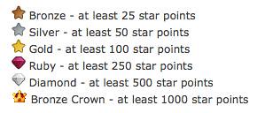
Thanks also to xxxovercastxxx for his wonderful new icons for star levels. *Ahem* more on those star levels in a minute ...
Somehow, between Germany (Fabio), California (Rommel) and Australia (me) - we formed a team- even though we were never all awake at the same time. For that reason we never managed to have an actual meeting. And that's why I'd like to finally thank an entity that probably doesn't get thanked much, but played a vital role in our project. Thanks Gmail. ;-)
Now on to the goodies.
Layout Features
Starting at the top of the screen- we've changed our logo. The old sifter was just not recognizable enough to most people. We've gone with something simple, but evocative of voting. It's source is also a vector image- so it lends well to other creations like t-shirts. (coming soon)
In the upper right hand corner, we've consolidated some site-wide icons. My favorite is the sun icon. Go ahead, click it - I'll wait ...
Ahh, sweet, sweet darkness. ;-) The other icons are self-explanatory and should be recognizable to most.
We've re-arranged the way the top tabs display information. We've done this based on our usage data - figuring out what items Sifters use most. Some things, like recent comments, were buried as a sub menu item- when really, it's one of the most used parts of the site. We've fixed that. It may take a while to get used to the new structure, but we think it will make it easier for most people to get to the menu items that are important.
Be sure to try out the "Recommended" sub menu item on the front page. This feature gives a selection of videos that may be interesting to you based on your personal voting history.
In the upper right again, there is the user control menu - from this dynamic menu you can login, logout, check your recent posts, jump to your profile or submit videos. The fly-out embed tester means you can quickly find out if what you are posting is a dupe without even leaving the page you're on. Pretty neat.
The video thumbnails have moved to the left of the window, and contain integrated buttons to perform a number of tasks related to posts. You can also tell at a glance if a post is in the dead pool or blocked.
We've also added a new Gallery View as an alternative to our standard vertical scroll listings. The Gallery view lets you see the front page in a more graphical way - grouping thumbnails together to view more content in a smaller area on the page.
Star Levels
On to a more contentious issue. We've nerfed member levels. When we first started VideoSift - we thought that surely no one would get beyond a gold star level. Now we have Sifters well on their way to 2,000 published posts. Blame us for poor planning, but the old structure had lots of level changes scrunched up towards the low point end, and then huge gaps between the higher levels. So, we've changed it thusly:

Powers have remained mostly the same for the new levels and can be reviewed here. Sorry if you feel like you have been demoted- we're definitely not trying to punish - but we want to make the rules about star levels as consistent and reasonable as possible.
New Hosts
We've added 5 news hosts to VideoSift that anyone can submit content from - they are:
Thanks go to KronosPoseiden - who was the source for these host additions.
New Invocations
We have a few new invocations. These first two are biggies and should help in building the community aspects of the Sift.
The first one you already know - *quality. It's part of our crowdsourced slogan "online video *quality control" . Until now, *quality only applied to Sift Talk posts. We're expanding it to include video posts as well - but it works in a different way. Instead of awarding a star point, a *quality invocation will give a new video a small boost in its "hotness" ranking - making it more likely to display at the top of the front page. It's a way to help new, worthy videos shine a bit more. *quality invocations require a silver star.
Our other new invocation is a doozy. *frontpage will send Sift Talk or blog posts to the very front page of the site, where they will hang around for a while before returning from whence they came. This should be used for things that we want to expose to the world to get a message out. Not to be used lightly, *frontpage requries a gold star and 3 power points.
In addition to these two major invocations, we've also added *notlong and *notbrief to undo mistaken *long and *brief invocations.
Custom Charter profiles and Channels
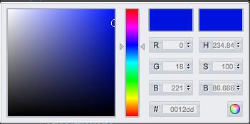
For those of you who don't like mucking with hex color values, we now have a neat color picker for charter members to customize their profiles.

Channels are a work in progress - we've done work to manually convert the styles of some channels like vintage and nature over to the new layout, but it's going to take a while for the rest. We're looking to bring in a color picker tool like the one used for profiles to let channel managers customize their channels in the same way. Bear with us while that comes online. Functionally, all channels should work just as before.
Other Changes
Here's something unique to most voting sites- we've enabled non-logged-in voting. That means that you can vote temporarily while not logged in- and then when you do log in eventually, all your votes are assigned to you. Temporary votes are only visible to the voter and don't become "real" until you sign-in or create an account (for new users).
We've added a "Newest Appreciated Comments" panel on the front page and video posts- it's a running, chronological list of comments that have just been upvoted.
We've improved our handling of Comedy Central videos- we now display their preview thumbnails and the videos may be resized to match bigger screens. No more tiny John Stewart vids for all you Daily Show addicts.
"Blocked" has been added as a submission option - no longer just an invocation. (Thanks Endall for catching this one.)
All charter members (as well as crowns) can have YouTube video avatars. This means their usual comment avatar images can be clicked and their video avatar will start playing.
New "Loose Width" and "Fixed Width" layout styles have replaced the resolution select list. "Loose" will always stretch the page to fit the width of your browser window. (Try them out at the bottom of the page.)
A new comment editor makes it easier to create bold, strikethrough, or italic text - and insert links.
Whew. So that's it. As I mentioned, 4.1 is already in the works- we'll have a brainstorming thread soon to get ideas for that. As this has been such a big change, you're bound to find bugs or issues with the way things work. Please use the 4.0 issues thread to let us know about anything you find. Lastly, I'd like to say a big thanks to all Sifters for making this place what it is. Did you know we're about to hit 1.7 million visitors a month? What a rush. And we owe everything to the community of this crazy place - including retaining the talented developers who have risen from the Sift ranks. Hugs and kisses to you all.
Edit: Whoops- forgot to mention that we've raised the queue escape limit to 15. Lets try it for a while and see how we go.
We've completely overhauled the user interface for VideoSift, making it easier to get to the good stuff and travel among major areas of the site. These changes are the work of one Fabio Scavone, known to you all as Campionidelmondo. Like everyone who has ever worked on VideoSift- he came up through the community - with a major talent for front-end design that was undeniable. Because he is a Sifter - he knows how the Sift works and how to improve the way we interact with it. I'm very happy to anounce that Fabio is now on staff as the VideoSift UI Developer and already working on front-end changes for 4.1. Thank you Fabio for pouring your heart into this project.
A good user interface only works when it's sitting on good software that supports it. Rommel prodded and tweaked the amazing VaroCMS that is his brainchild- to support the UI changes and make the front-end seamlessly meld with the back. I'm very fortunate to have Lucky as a partner or else we would probably still be languishing in shades of military green. Thanks as usual to my comrade in Sift.
Next, thanks to all the alpha testers who ran the new site through its paces on our extremely weak development server- we'll be calling on your services again someday.
Thanks also to xxxovercastxxx for his wonderful new icons for star levels. *Ahem* more on those star levels in a minute ...
Somehow, between Germany (Fabio), California (Rommel) and Australia (me) - we formed a team- even though we were never all awake at the same time. For that reason we never managed to have an actual meeting. And that's why I'd like to finally thank an entity that probably doesn't get thanked much, but played a vital role in our project. Thanks Gmail. ;-)
Now on to the goodies.
Layout Features
Starting at the top of the screen- we've changed our logo. The old sifter was just not recognizable enough to most people. We've gone with something simple, but evocative of voting. It's source is also a vector image- so it lends well to other creations like t-shirts. (coming soon)
In the upper right hand corner, we've consolidated some site-wide icons. My favorite is the sun icon. Go ahead, click it - I'll wait ...
Ahh, sweet, sweet darkness. ;-) The other icons are self-explanatory and should be recognizable to most.
We've re-arranged the way the top tabs display information. We've done this based on our usage data - figuring out what items Sifters use most. Some things, like recent comments, were buried as a sub menu item- when really, it's one of the most used parts of the site. We've fixed that. It may take a while to get used to the new structure, but we think it will make it easier for most people to get to the menu items that are important.
Be sure to try out the "Recommended" sub menu item on the front page. This feature gives a selection of videos that may be interesting to you based on your personal voting history.
In the upper right again, there is the user control menu - from this dynamic menu you can login, logout, check your recent posts, jump to your profile or submit videos. The fly-out embed tester means you can quickly find out if what you are posting is a dupe without even leaving the page you're on. Pretty neat.
The video thumbnails have moved to the left of the window, and contain integrated buttons to perform a number of tasks related to posts. You can also tell at a glance if a post is in the dead pool or blocked.
We've also added a new Gallery View as an alternative to our standard vertical scroll listings. The Gallery view lets you see the front page in a more graphical way - grouping thumbnails together to view more content in a smaller area on the page.
Star Levels
On to a more contentious issue. We've nerfed member levels. When we first started VideoSift - we thought that surely no one would get beyond a gold star level. Now we have Sifters well on their way to 2,000 published posts. Blame us for poor planning, but the old structure had lots of level changes scrunched up towards the low point end, and then huge gaps between the higher levels. So, we've changed it thusly:

Powers have remained mostly the same for the new levels and can be reviewed here. Sorry if you feel like you have been demoted- we're definitely not trying to punish - but we want to make the rules about star levels as consistent and reasonable as possible.
New Hosts
We've added 5 news hosts to VideoSift that anyone can submit content from - they are:
- 5min - Instructional and DIY videos
- Blip.tv - Creative indy podcasts and videoblogs
- Current - News videos and current affiars
- Funny or Die - edgy comedy videos
- Reuters - Hard news
Thanks go to KronosPoseiden - who was the source for these host additions.
New Invocations
We have a few new invocations. These first two are biggies and should help in building the community aspects of the Sift.
The first one you already know - *quality. It's part of our crowdsourced slogan "online video *quality control" . Until now, *quality only applied to Sift Talk posts. We're expanding it to include video posts as well - but it works in a different way. Instead of awarding a star point, a *quality invocation will give a new video a small boost in its "hotness" ranking - making it more likely to display at the top of the front page. It's a way to help new, worthy videos shine a bit more. *quality invocations require a silver star.
Our other new invocation is a doozy. *frontpage will send Sift Talk or blog posts to the very front page of the site, where they will hang around for a while before returning from whence they came. This should be used for things that we want to expose to the world to get a message out. Not to be used lightly, *frontpage requries a gold star and 3 power points.
In addition to these two major invocations, we've also added *notlong and *notbrief to undo mistaken *long and *brief invocations.
Custom Charter profiles and Channels
For those of you who don't like mucking with hex color values, we now have a neat color picker for charter members to customize their profiles.

Channels are a work in progress - we've done work to manually convert the styles of some channels like vintage and nature over to the new layout, but it's going to take a while for the rest. We're looking to bring in a color picker tool like the one used for profiles to let channel managers customize their channels in the same way. Bear with us while that comes online. Functionally, all channels should work just as before.
Other Changes
Here's something unique to most voting sites- we've enabled non-logged-in voting. That means that you can vote temporarily while not logged in- and then when you do log in eventually, all your votes are assigned to you. Temporary votes are only visible to the voter and don't become "real" until you sign-in or create an account (for new users).
We've added a "Newest Appreciated Comments" panel on the front page and video posts- it's a running, chronological list of comments that have just been upvoted.
We've improved our handling of Comedy Central videos- we now display their preview thumbnails and the videos may be resized to match bigger screens. No more tiny John Stewart vids for all you Daily Show addicts.
"Blocked" has been added as a submission option - no longer just an invocation. (Thanks Endall for catching this one.)
All charter members (as well as crowns) can have YouTube video avatars. This means their usual comment avatar images can be clicked and their video avatar will start playing.
New "Loose Width" and "Fixed Width" layout styles have replaced the resolution select list. "Loose" will always stretch the page to fit the width of your browser window. (Try them out at the bottom of the page.)
A new comment editor makes it easier to create bold, strikethrough, or italic text - and insert links.
Whew. So that's it. As I mentioned, 4.1 is already in the works- we'll have a brainstorming thread soon to get ideas for that. As this has been such a big change, you're bound to find bugs or issues with the way things work. Please use the 4.0 issues thread to let us know about anything you find. Lastly, I'd like to say a big thanks to all Sifters for making this place what it is. Did you know we're about to hit 1.7 million visitors a month? What a rush. And we owe everything to the community of this crazy place - including retaining the talented developers who have risen from the Sift ranks. Hugs and kisses to you all.
Edit: Whoops- forgot to mention that we've raised the queue escape limit to 15. Lets try it for a while and see how we go.


Load Comments...
Discuss...
Enable JavaScript to submit a comment.